Control Center
Since its introduction in 2013, Control Center has become a staple of iOS, providing users with a panel of commonly accessed shortcuts. iOS 10’s Control Center is a radical shift from its origins, and a harbinger of how iOS is changing.
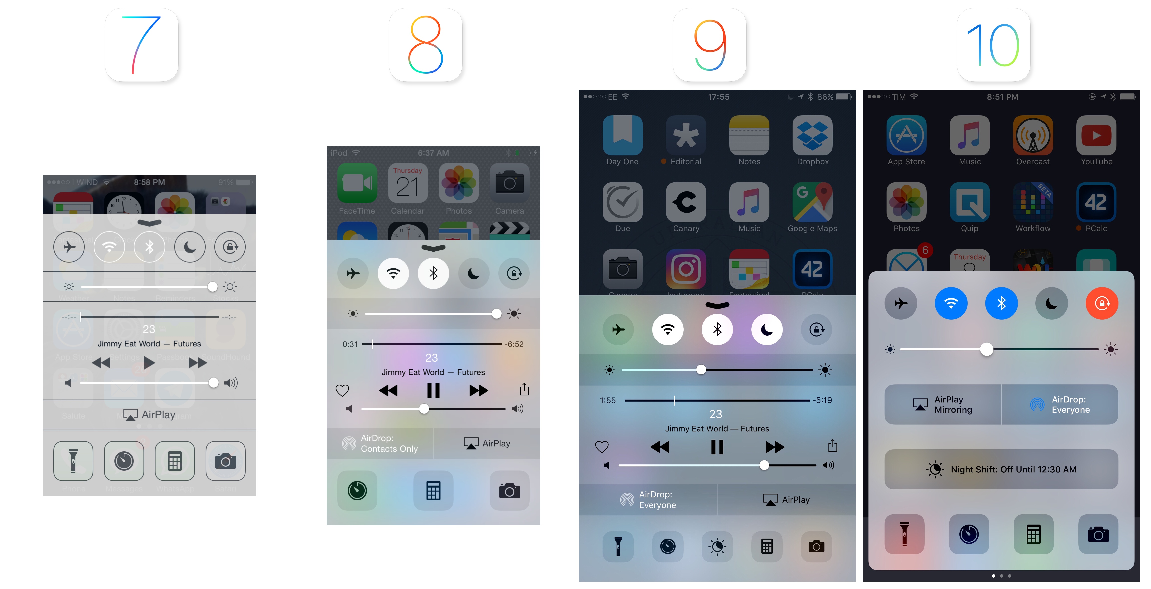
Control Center’s design has evolved over the years, from the wireframe-like look of iOS 7 to the friendlier, rounder buttons of iOS 9.
Apple wasn’t led astray by the expansion of iOS, to the point where cramming more functionality into Control Center turned into a balancing act of prioritizing important controls without sacrificing their purpose.
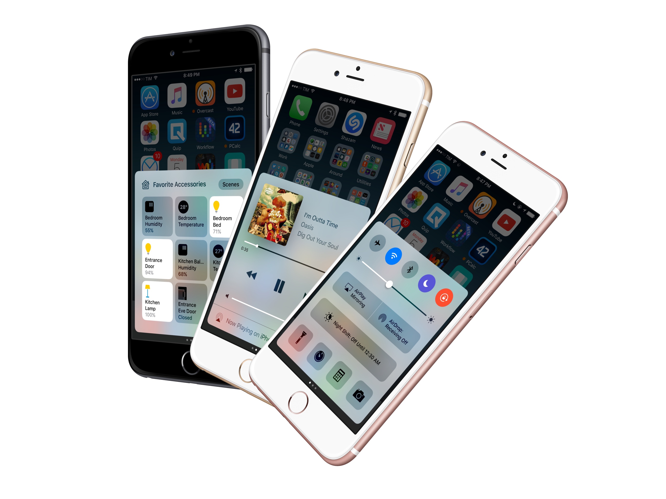
It was clear that Control Center’s original vision couldn’t scale to the growing nature of iOS. And so with iOS 10, Apple has torn down Control Center and started from scratch. The single-page mosaic of tiny buttons is no more. The new Control Center breaks up system shortcuts and audio controls in two separate pages, with the addition of a third page for HomeKit (if available). Everything’s bigger, spacious, and colorful.
You still open Control Center with a swipe from the bottom of the display. In iOS 10, swiping pulls up a card with paginated controls underneath it. The design is familiar, yet unmistakably new. Margins across each side convey the card metaphor; controls are bigger and buttons have more padding; there’s more color in every card.
After three years of Control Center, the new version in iOS 10 feels lively and friendly; perhaps even more fun. On the other hand, pagination and bigger controls raise a question: has simplicity come at the expense of efficiency in Control Center?
System Controls
A useful exercise to understand Control Center in iOS 10 is to take stock of how much Apple is leaving behind. Let’s compare iOS 9’s Control Center to the same screen in iOS 10:

The first page of Control Center in iOS 10 has lost audio playback. Initially, that may feel like a downgrade. But let’s swipe left and consider what Control Center has gained by separating system and audio controls:
The difference is striking. Giving audio playback its own space lets Control Center present more information for the media being played. It’s also more accessible thanks to bigger text labels, buttons that don’t need to be carefully tapped, and hardware controls embedded in the same page.
This won’t be easy to accept for iOS power users who cherish dense UIs: Control Center buys into a trend followed by many (but not all) parts of iOS 10. Big, bold controls, neatly laid out, spread over multiple views.
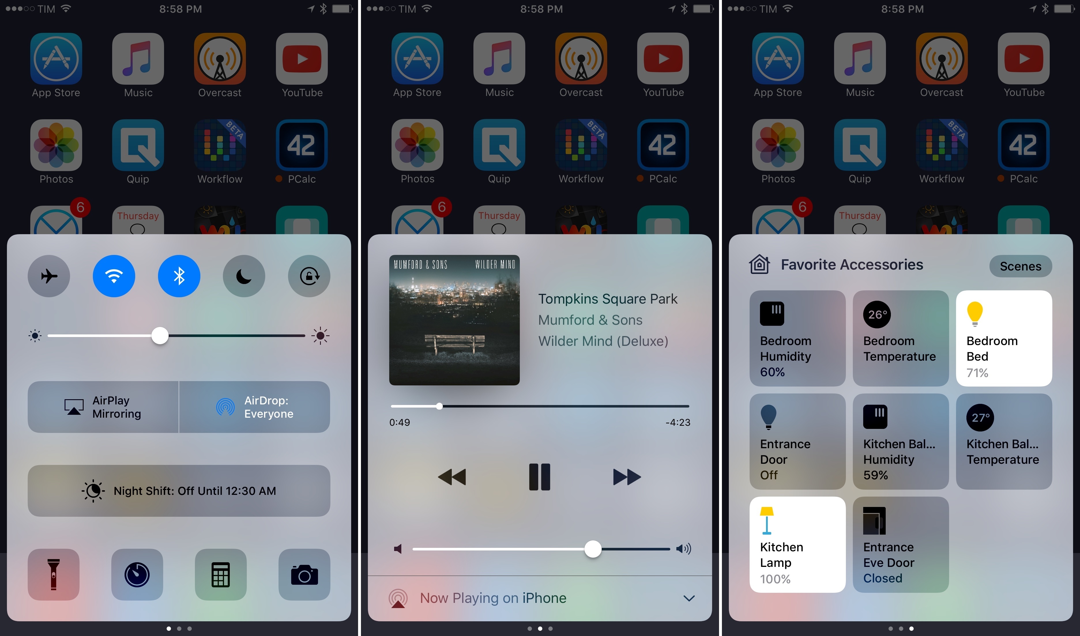
The first beneficiary of such clarity is the system controls page. The first row of toggles at the top has kept iOS 9’s iconography and arrangement, but each button is color-matched to the setting it activates when toggled.9

I found colored toggles extravagant at first; now, I like that I can glance at those buttons and know which setting is engaged.

The brightness slider and the AirPlay, AirDrop, and Night Shift buttons have been enlarged and simplified as well. For one, the slider’s puck is more comfortable to grab. The buttons reveal another tendency in iOS 10’s semi-refreshed design language: they’re actual buttons with rounded borders and they use color to indicate status.

In a change that’s reminiscent of Sam Beckett’s fantastic concept, you can press on the bottom row of shortcuts to show a list of 3D Touch quick actions. These include three intensity levels for the flashlight, timer options, a shortcut to copy the last Calculator result, and different Camera modes.
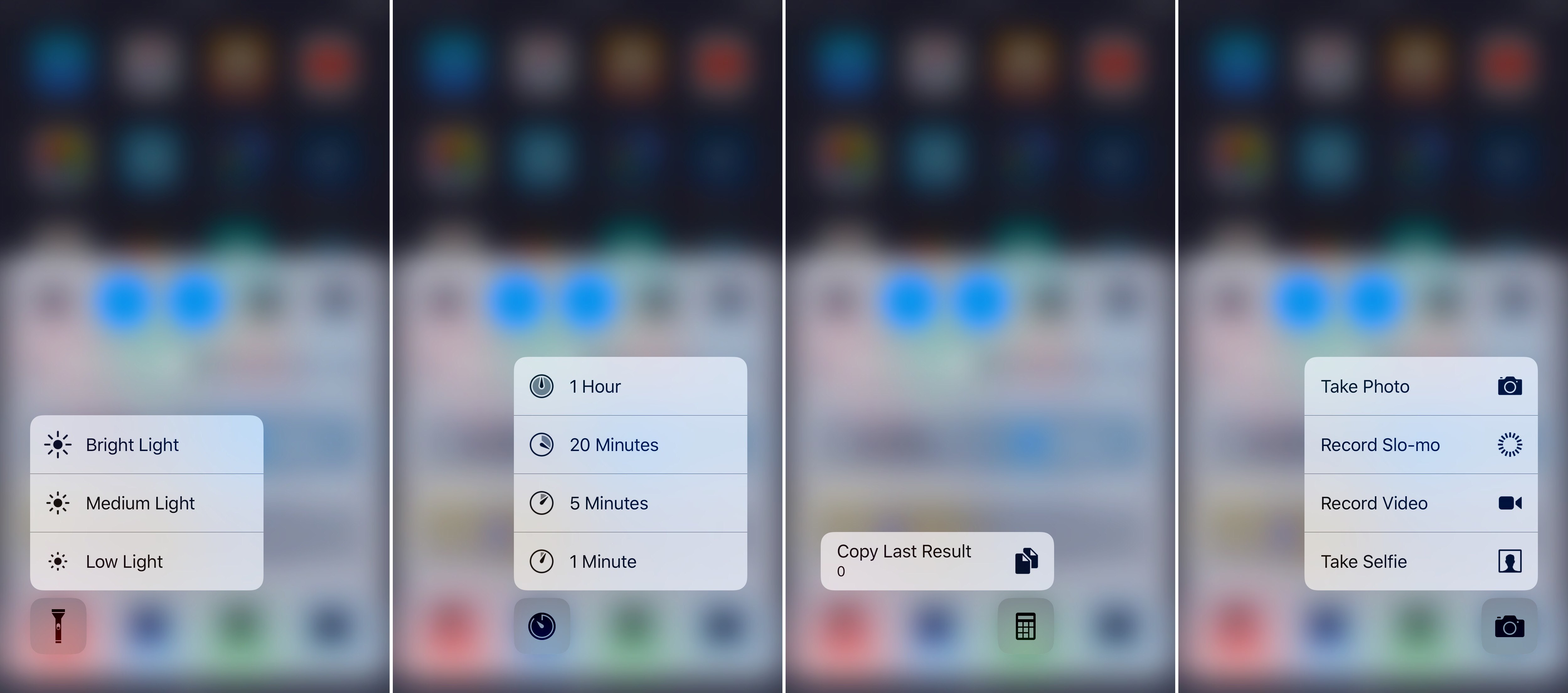
As I elaborated before, Control Center was an ideal candidate for 3D Touch actions. However, Apple’s implementation in iOS 10 is limited to the bottom row of apps; you can’t press on the Bluetooth icon to connect to previously paired devices, nor can you press on the Wi-Fi toggle to connect to a different network. The addition of 3D Touch to the lower end of Control Center shows that Apple recognizes the utility of quick actions for system-wide shortcuts, but they’re not fully committed to the idea yet.
Despite some missing features and growing pains to be expected with a redesign, iOS 10’s first Control Center page is an improvement. With a sensible reliance on color, a more legible layout, and the first steps toward full 3D Touch support, Control Center’s system card is easier to parse, nimble, and intuitive.
“It Also Looks Great on the iPad”
Control Center’s design direction has been taken to the extreme on the iPad. Only one page can be used at a time; the AirDrop, AirPlay, and Night Shift buttons are needlessly wide. It doesn’t take a design expert to figure that Apple just wanted to ensure basic compatibility with an iPhone feature instead of designing Control Center around the iPad.
Look at it this way: if Control Center didn’t exist on the iPhone and Apple decided to introduce it on the iPad today, would it look like this?

The lack of an iPad-first approach was passable in the old Control Center because of its compact design. But with iOS 10, following the iPhone’s model has a detrimental effect. Buttons are too big and little care went into optimizing the UI for the iPad’s screen. Apple should reconsider what they’re doing with Control Center on the iPad instead of upscaling their iPhone designs.
Music Controls
In iOS 10, managing music and audio playback from Control Center is a richer experience, visually and functionally superior to iOS 9.
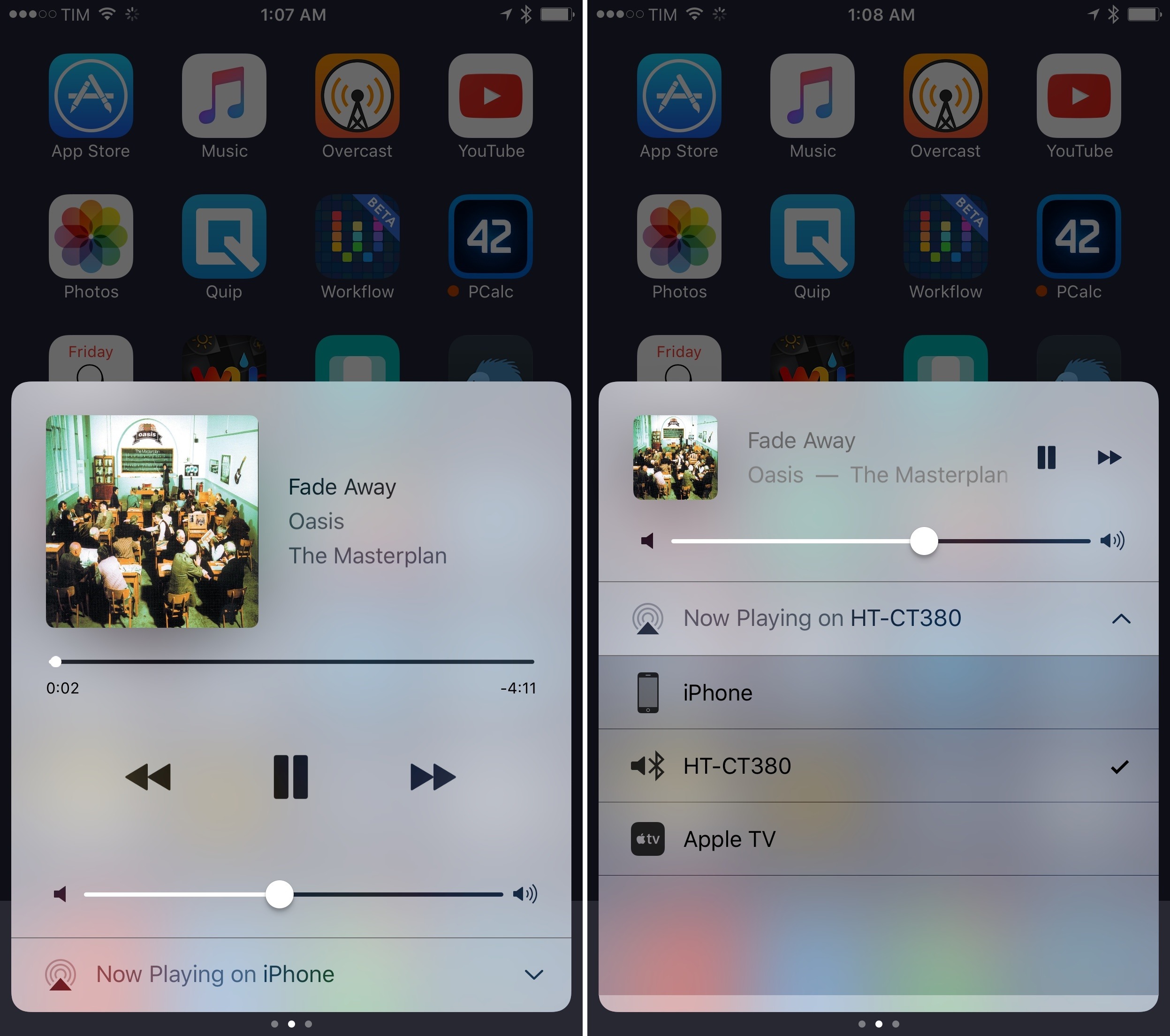
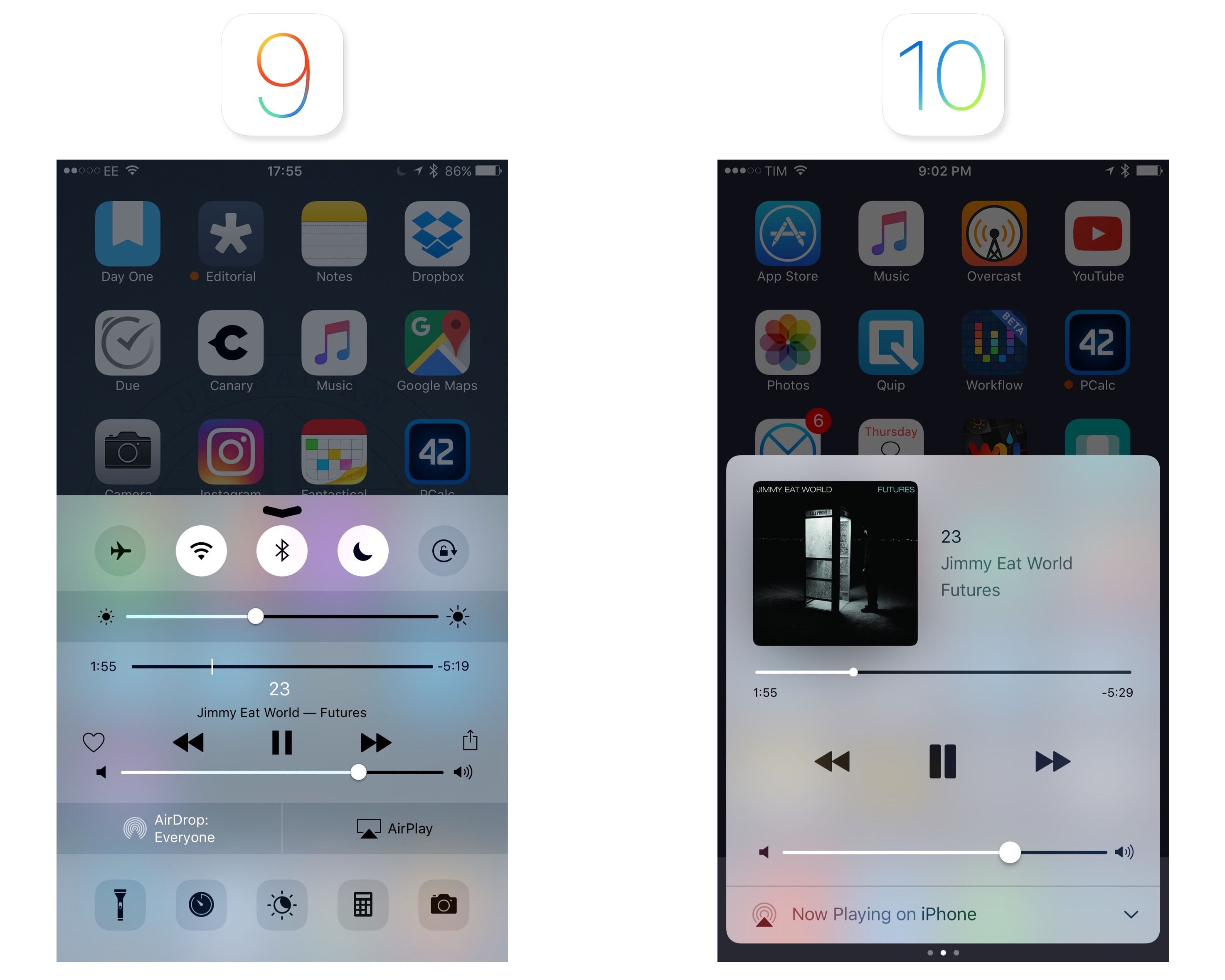
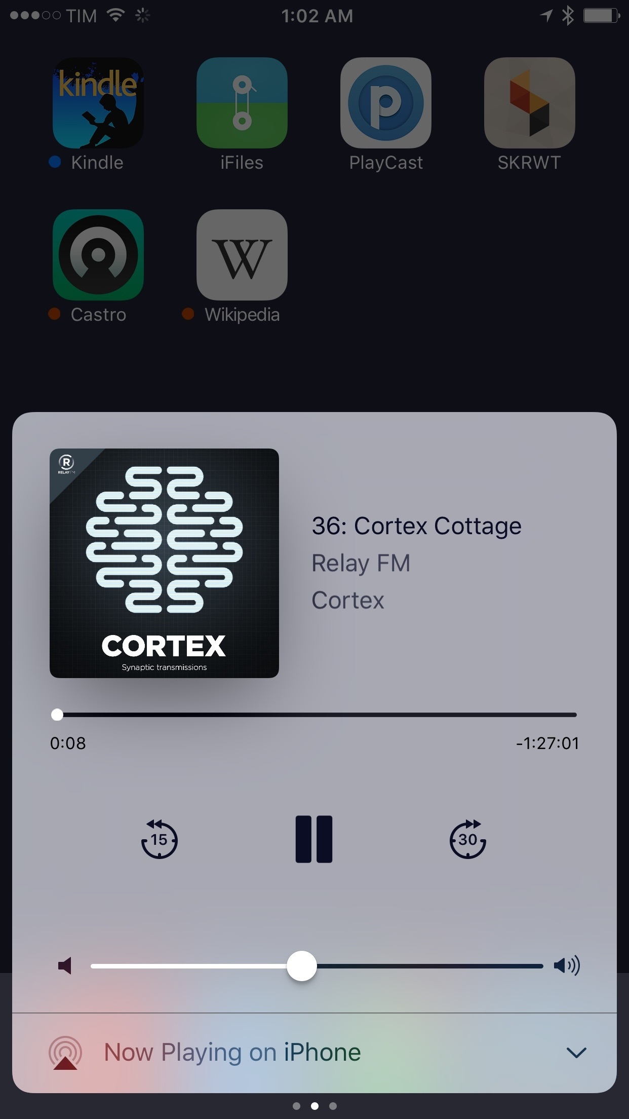
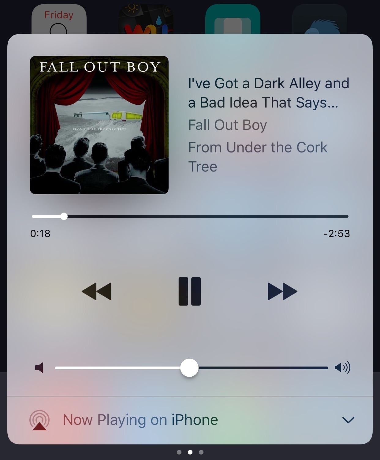
The page is split in three areas: audio information and, for the first time, artwork at the top; progress, playback controls, and volume in the middle; hardware accessories at the bottom. This is true for Apple Music and Podcasts as well as third-party apps, which don’t need to optimize for iOS 10 to show album artwork.

Apple Music

Overcast
Castro
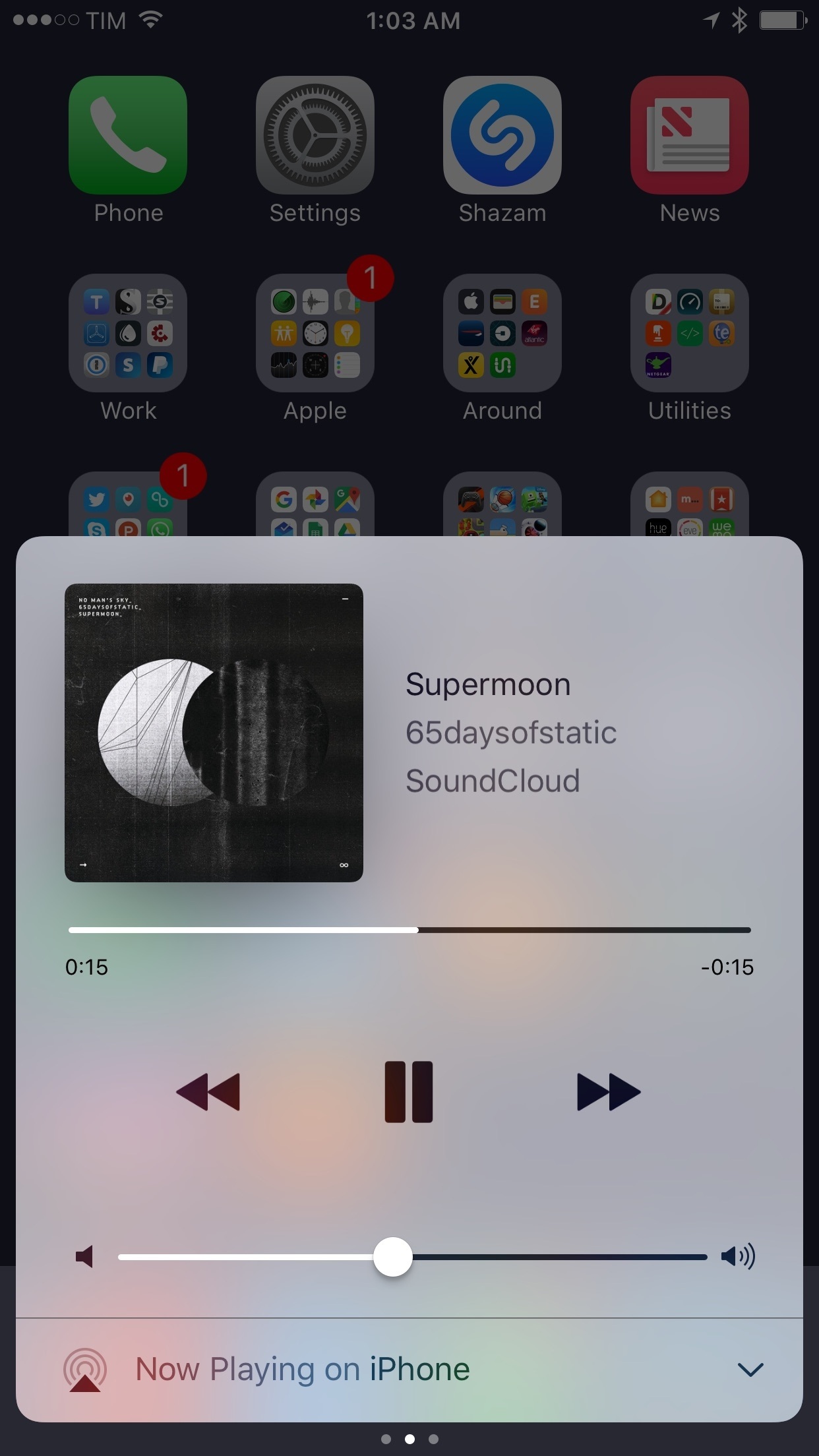
SoundCloud
I was skeptical when I saw that Apple moved audio controls to a separate card. The ubiquitous presence of an audio widget was my favorite aspect of Control Center; adding an extra step to reach it didn’t seem a good idea. After adjusting to Control Center’s audio page in the first month of iOS 10, I went back to iOS 9 and controlling music felt limited and bland.
There are two aspects to Apple’s design worth noting. First, Control Center remembers the page you were using before dismissing it. If you swipe up, swipe left to open music playback, then close Control Center, the next time you open it, you’ll get the Now Playing card instead of being taken back to the first page. Thanks to this, having audio controls on a separate page hasn’t been a problem in my experience, but I wonder if Apple should allow reordering pages as an option.
Second, the purpose of the redesign. With artwork and comfortable UI elements, the page feels like a miniaturized music app rather than a cumbersome mishmash of buttons and sliders. It’s almost as if Control Center was reimagined for how normal people like to know what’s playing.
From an interaction standpoint, artwork creates a bigger touch target that you can tap to be taken into the app playing audio10; in iOS 9, you had to precisely tap on a song’s small title in Control Center. There’s a deeper sense of context, too. Previously, it always took me a few seconds to read through a song’s information. With iOS 10, I can swipe up and glance at the artwork to see what I’m listening to.
There’s a subtle touch I want to mention. When music is playing, artwork is big, it has a drop shadow, and Control Center says ‘Now Playing on…’ at the bottom with an icon for the device where audio output is happening. Hit pause, and the artwork shrinks, losing the drop shadow, as the ‘Now Playing…’ message disappears. Tap play again, and the artwork grows bigger with a delightful transition.
Control Center’s music playbackReplay
Control Center’s audio page has two functional problems Apple should address. Song details (title, artist, and album) have been turned into lines of text that don’t scroll and get cut off. Try to listen to songs with long titles – say, I’ve Got a Dark Alley and a Bad Idea That Says You Should Shut Your Mouth (Summer Song) – and you’ll be surprised Apple designers didn’t consider the issue.
In addition, the ability to “love” songs to train Apple Music has been removed from Control Center (and the Lock screen). I don’t understand the decision, as having a dedicated page provides even more room for music controls.
Despite the merits of artwork and more intuitive controls, I don’t think Apple added a standalone audio card to Control Center for those reasons alone. To me, the most convincing explanation comes from the hardware menu:
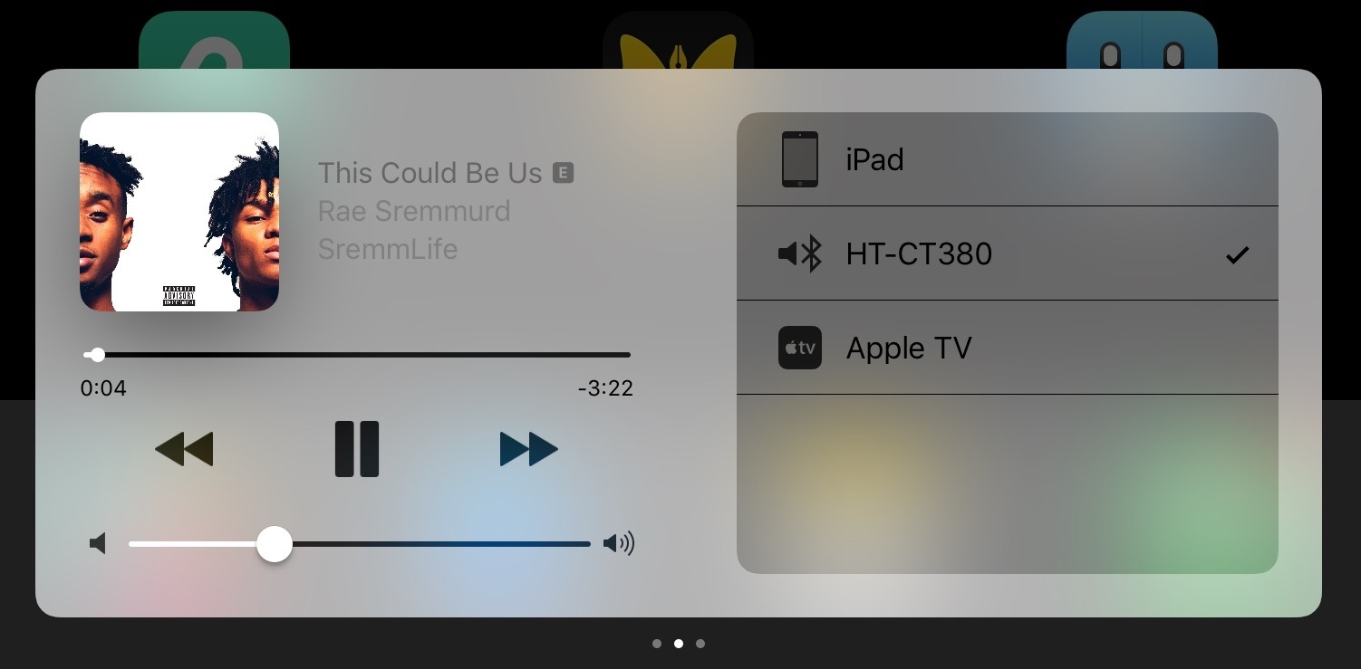
With just a few taps, you can connect to Bluetooth headphones or wireless speakers from anywhere on iOS without opening Settings. There’s an obvious subtext: for a device without a headphone jack, an easier way to switch between wireless audio accessories isn’t just a pet peeve – it’s a necessity.
Audio playback is the clear winner of the new Control Center in iOS 10. Apple freed themselves from the constraints of iOS 9’s tiny audio controls, and, after three years, music is claiming the prime spot it deserves in Control Center. The new audio page brings a more engaging, integrated listening experience that paves the road for what’s to come.
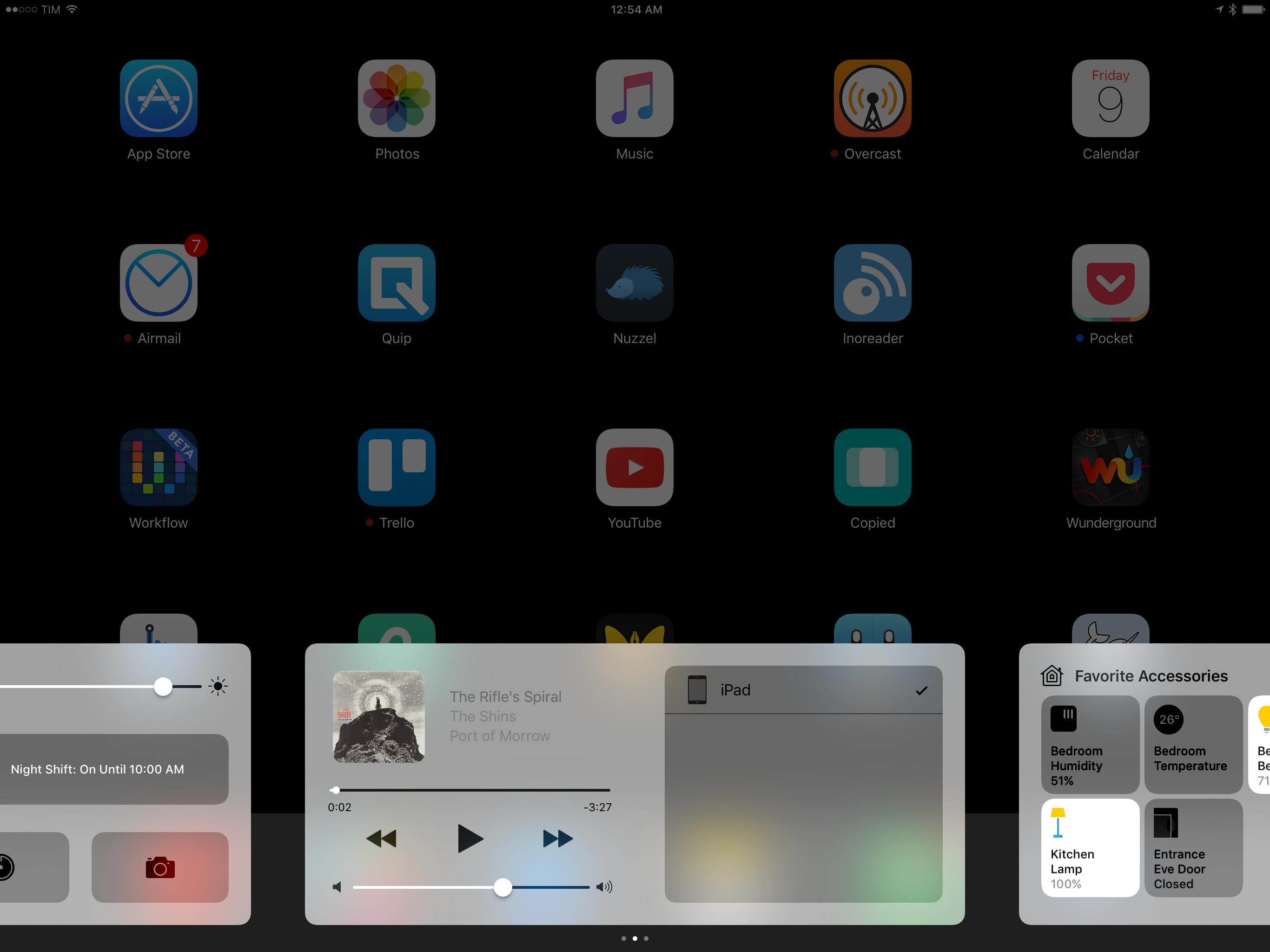
HomeKit Controls
You can’t use the third page of Control Center unless you’ve configured at least one HomeKit device. I don’t own a lot of HomeKit accessories (I have three Hue lights and a few Elgato sensors), but the new Home page has grown so much on me, I’m no longer using any third-party HomeKit widgets.
Besides being available to users with HomeKit devices, Control Center’s Home card only displays accessories and scenes that have been marked as favorites in the new Home app. The page doesn’t list every HomeKit accessory, nor does it work with third-party home automation devices that don’t support HomeKit.
If you meet these requirements, you’ll be able to swipe over the Music card to reveal the Favorite Accessories view.
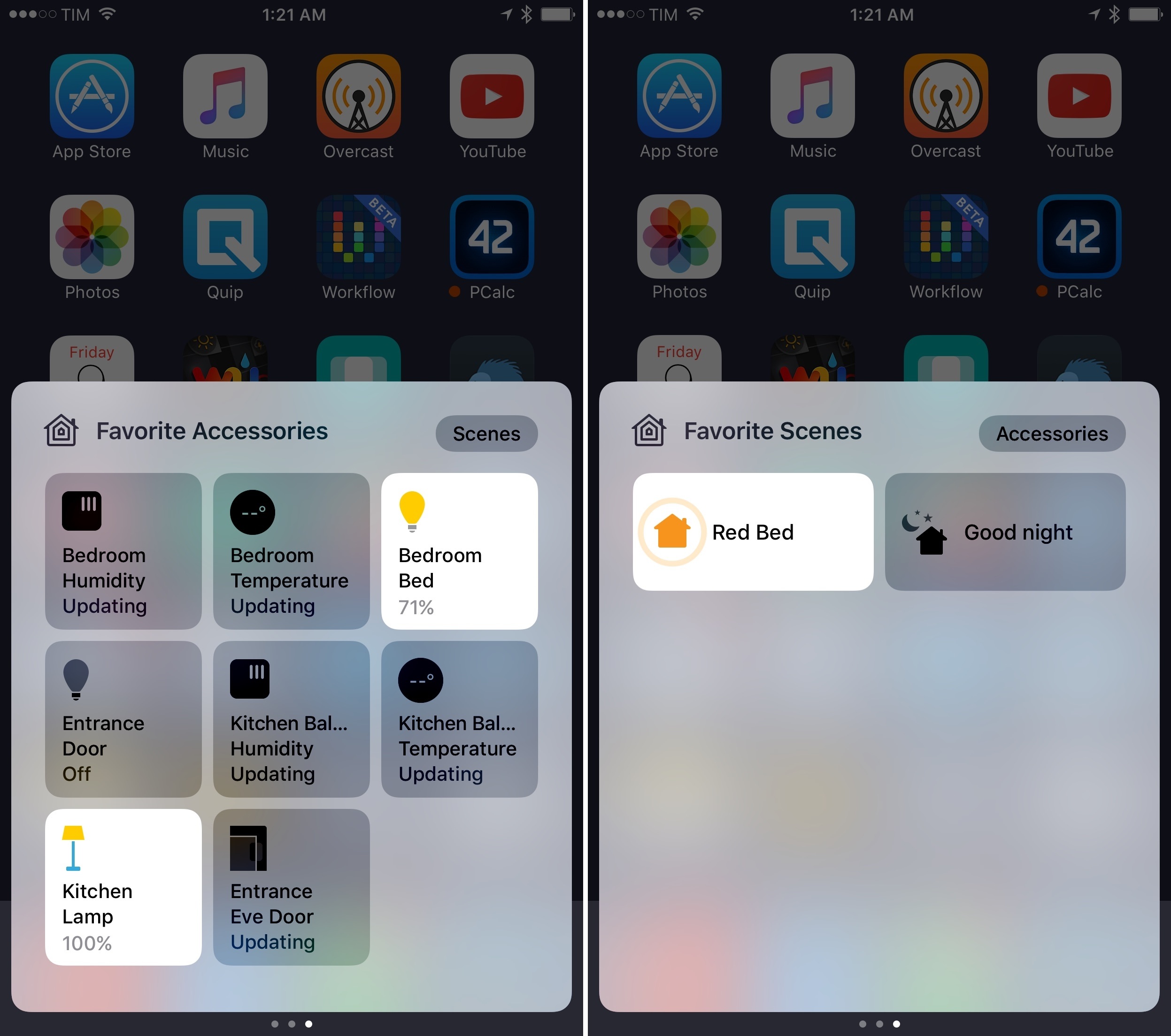
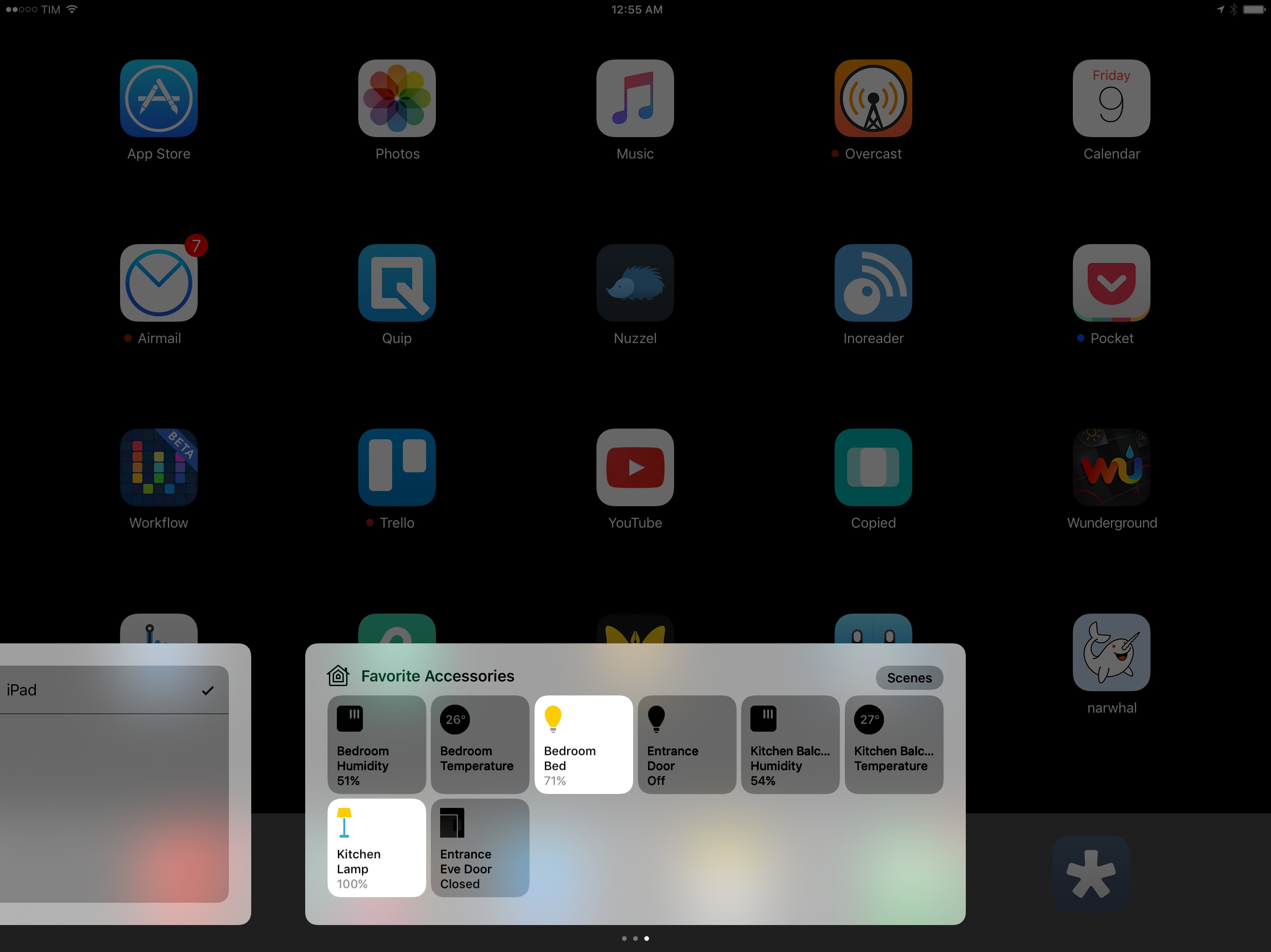
Accessory buttons carry a name and icon assigned in the Home app, and, if supported, a percentage label for intensity (lights have it, for example). A button in the top right lets you switch between accessories and scenes. To turn them on and off, you just tap a button once.
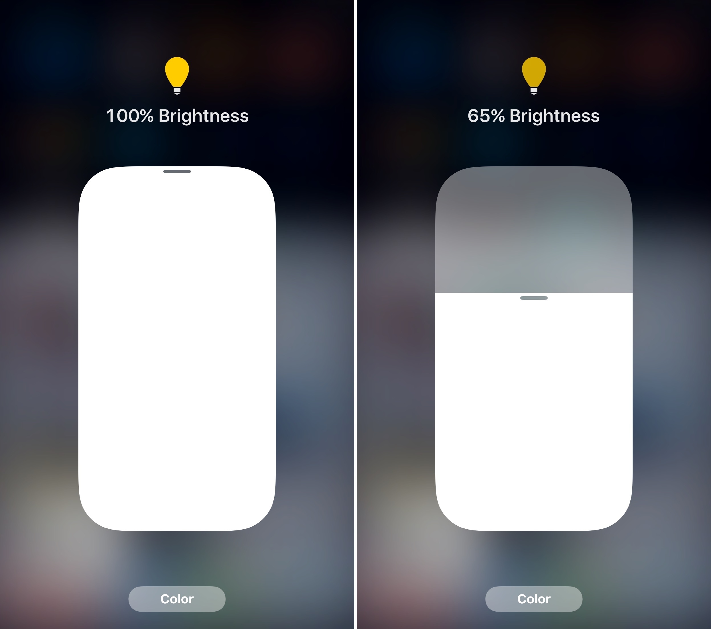
Buttons can be long-tapped to open a detail screen with more options.11 For my Hue lights, holding a button for a fraction of a second reveals a vertical slider for intensity, which can be adjusted without lifting a finger off the screen.
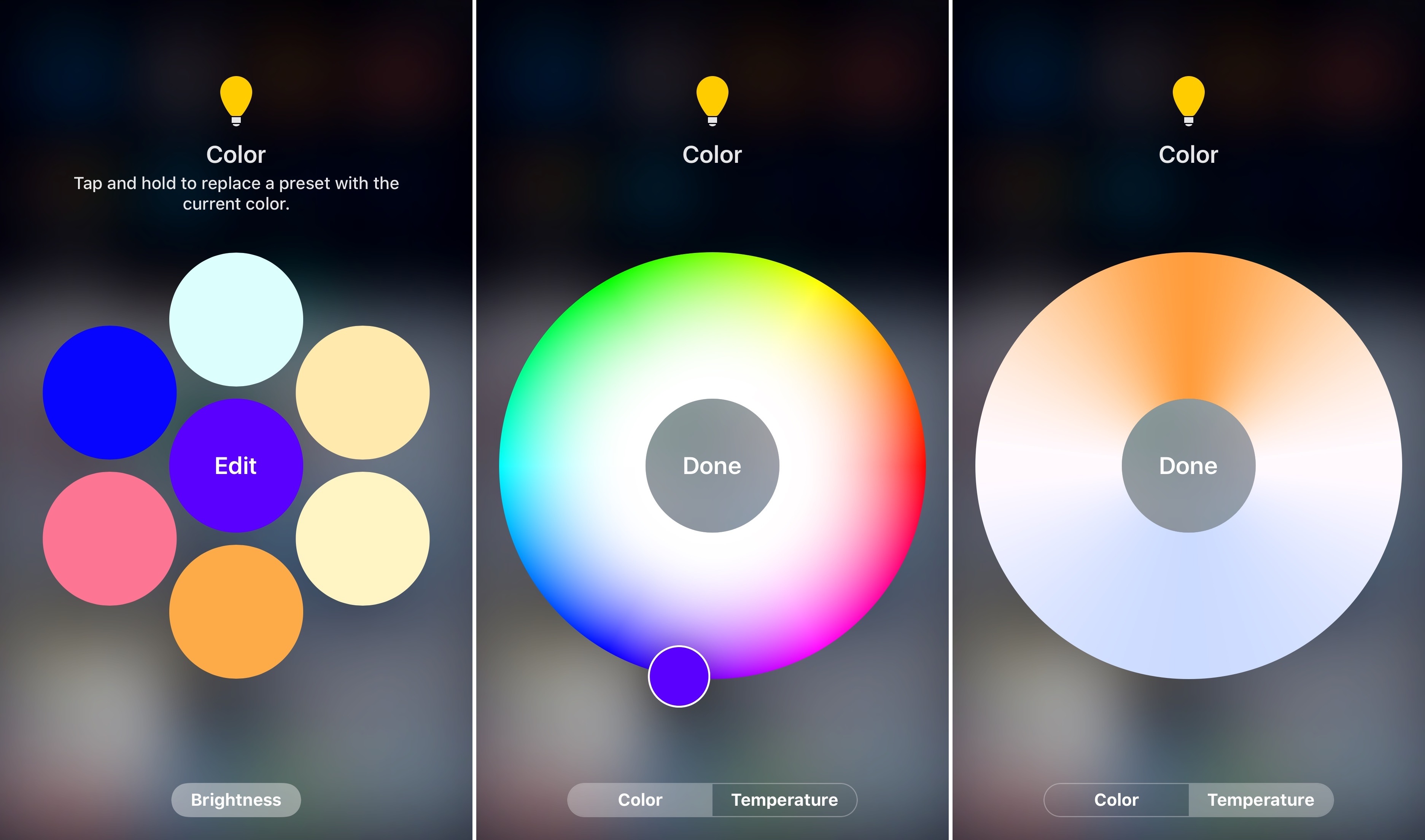
A second layer of navigation is nested into the detail view. With multicolor lights, you can tap on a Colors button below the intensity slider to modify presets and open a color wheel to pick a different shade. The wheel even has a segmented control to switch between color and temperature – a surprisingly deep level of hierarchy for a Control Center page.
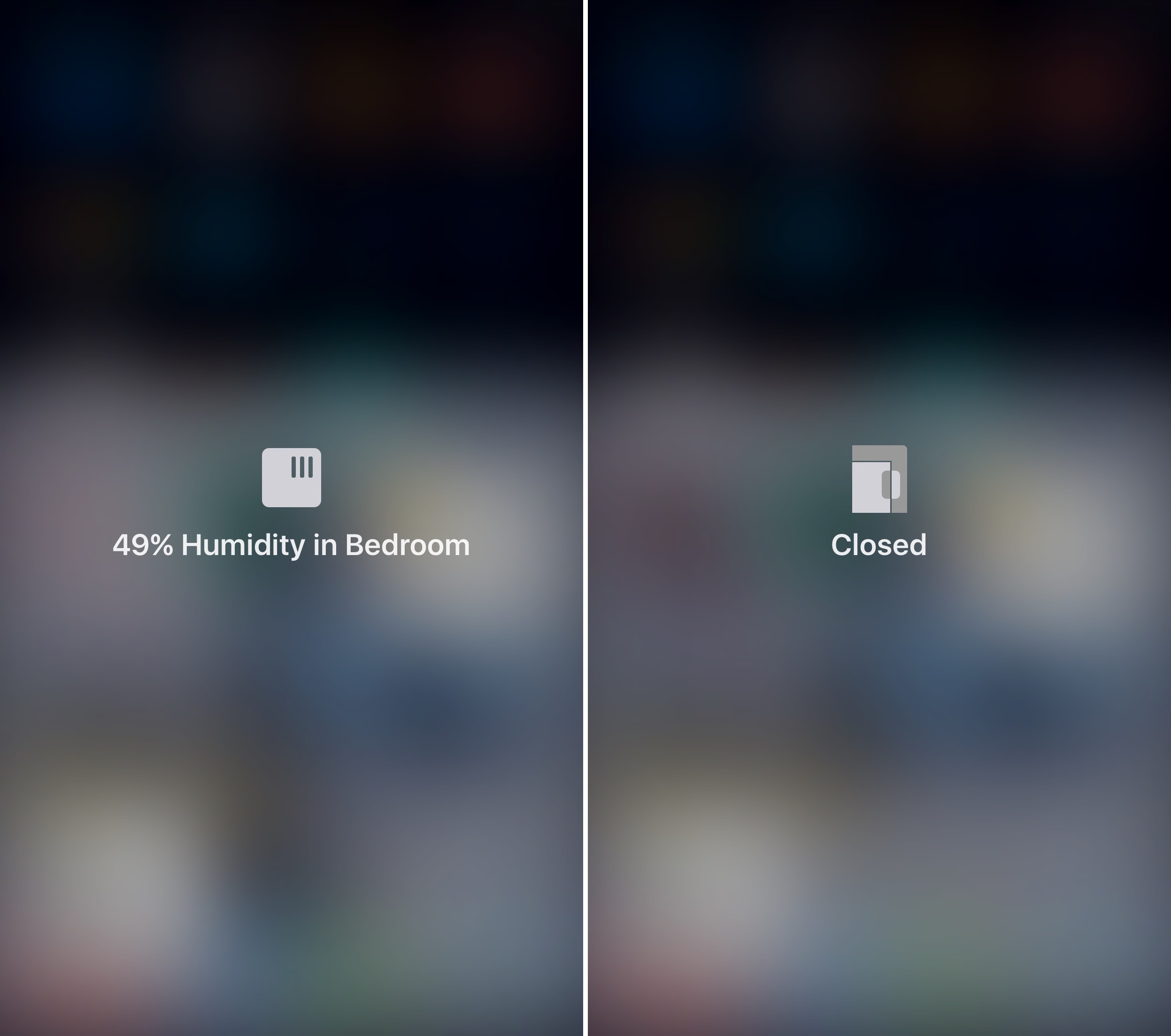
Unfortunately, accessories that only report basic status messages don’t have a useful detail view.
In spite of my limited testing environment, Control Center has become my favorite way to manage HomeKit lights and scenes. It’s a testament to Apple’s penchant for native integrations: lights turn on immediately because commands don’t go through a third-party server, and the entire flow is faster than asking Siri to activate an accessory. I was a heavy user of third-party HomeKit widgets and apps before; on iOS 10, I have no reason to do that anymore thanks to Control Center.
If Apple didn’t have big plans for the connected home, they wouldn’t have given HomeKit its own section in Control Center. With HomeKit expanding to new accessory lines, I think it’s going to be my second most used card after music.
Extended Control
After three years, Control Center is growing up. To make the pendulum swing back towards simplicity, Apple has traded some convenience of the original design for three standalone pages. By unbundling functionality in discrete units, Control Center is more legible, usable, and flexible.
There are missteps. The lack of any kind of user customization is inexcusable in 2016. The bottom row of shortcuts, down to four icons again, still can’t be modified to accommodate user-selected apps. And you won’t be able to swap toggles at the top for settings you access on a frequent basis.
Half-baked integration with 3D Touch feels like a timid attempt to take Control Center further. The addition of quick actions for apps in the first page is laudable, but why isn’t the same true for toggles at the top as well? And if HomeKit accessories can show nested detail views, why can’t Apple Music display a lyrics screen, too?
I want to believe that iOS 10’s Control Center is foreshadowing the ability for developers to provide their own “app pages” and for users to swap default shortcuts with their favorite ones. More than ever before, Control Center is ripe for extensibility and personalization. Like widgets, I can see a future where we interact with some types of apps primarily through mini interfaces in Control Center.
I wouldn’t have expected pagination to be what I wanted, but Apple was right in rethinking Control Center as a collection of pages rather than a complex unified dashboard. The majority of iOS users won’t be affected by Apple’s design trade-offs; they’ll appreciate a screen that doesn’t need a manual.
The new Control Center experience isn’t a regression; it’s a much needed reassessment of its role in the modern iOS.
- Rotation Lock is the only toggle that doesn't carry the color of the screen in Settings where it belongs, but it looks nice and stands out nevertheless. ↩︎
- If no audio is playing, Control Center shows a button for the last app that played audio. ↩︎
- Interestingly, Apple isn't using 3D Touch to expand accessories into detail views. A long tap on a button triggers haptic feedback and pops into a view, but you can't apply multiple levels of force to watch the button expand and shrink (like you can in the first page of Control Center). It's not the only case of Apple coupling haptic feedback (once exclusive to 3D Touch) with long taps in iOS 10, though. ↩︎